Società Impianti Bormio is about to launch the new winter season 2011/2012 with some big news, starting from a renovated image to display to custumers and consumers.
The ski area of Bormio has, a matter of fact, gotten a total new look presenting the new brand Bormio Ski. A total rebranding action which has involved many aspects of the company's image:
- the name and logotype
- the symbol
- the management of the image (creation of a payoff, organization fonts and colors, values and company's mission)
- new marketing and communication strategies (online precence mainly)

1 - The new brand Bormio Ski is a change in name
The process of the company's rebranding went through the change in name, first of all. The use of the Italian Società Impianti Bormio was substituted in favor of Bormio Ski.
The choice of the logotype BORMIO SKI (the logotype is the word imprint) was made for an easier and shorter lettering, easily pronounceable worldwide, more repeatable, better performing on search engine and graphically more flexibile.
2 - The new symbol
The new company's symbol (the distinguished picture of the brand) is for sure more captivating and modern than the previous one.
Also, it's an iconic symbol: the mountain made of three peaks, with the higher one in the middle, represents the dominating vertical character of Bormio's ski area.

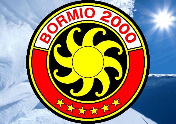
The famous and historic "symbol with the sunflower" went, then, abandoned.

3 - The management of the new image
A new organization payoff was created linked to the new brand Bormio Ski: "We are vertical fun", which expresses the concept of the formidable vertical drop of the ski area, together with the idea of a community ("we") and "fun" because, for us, ski and mountain are fun, first of all.
The organization payoff connect us with the company's values and mission: we love skiing and the mountain and our mission is to make people feel good through skiing so that they can feel free, happy, entertained.
The brand's image passes through the font and colors used, too. From the previous black, yellow, white, red we moved to simply black and red. The fonts, not well defined before, are now two: Khand for title and Lato for paragraphs.
4 - New marketing and communication strategies
The change of identity is the basis of rebranding which leads to a huge and radical change in the advertising approach of a company.
The new brand launched our company into the digital marketing world with activities such as blogging, perpetual presence on social networks, online advertising campaigns and email marketing.
NOVEMBER 28, 2011 - Article updated on August 27, 2016
The graphic art of the brand Bormio Ski is a work by Michele Urbani
Brand manual for the proper use of Bormio Ski (download available): Brand Manual

